 Technical analysis is a method used by traders to determine whether they should trade and how to go about it. Through the use of technical analysis (TA), traders try to find an ‘entry’ (the right moment to enter a trade) and extrapolate its course of development. TA isn’t something that can be taught overnight since it’s mostly a matter of learning by doing, and most likely making some mistakes. There are no guarantees when using TA and it should only be used as a tool to gain more insight when trading. Technical analysis is often used for short term trading while FA (fundamental analysis) is mostly used for long term trades.
Technical analysis is actually a technique based on the fundamentals of mass psychology; many patterns are linked to human behavior. In this beginner’s guide we’ll tell you about market cycles, which indicators are used, and the types of patterns that can be seen in charts. Since substantial and valid TA is too big of a subject to handle briefly, this article should be viewed as an introduction to technical analysis. It should not function as trading advice.
DISCLAIMER
This guide is a brief introduction to technical analysis and it is merely a brief (and incomplete) summation of several well known terms. It should only be used as beginner’s guide to learn the meaning of used terms and concepts.
Timeframes and trends
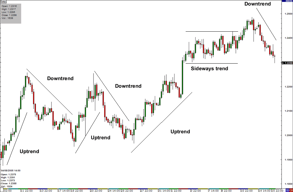
To start analyzing, one has to determine a timeframe to search for indicators, trends, and patterns. A graph of a single day or a week can look totally different from a graph of that same market in a time frame of a year. Always zoom out to get a good look at the market in several time frames. That way you can try to discern whether the market is in an upward or downward trend in the long term or short term.
Market cycles
A well known term that is represented in a graphic: market cycles. When zooming out to use a wider timeframe, you’ll often notice this pattern. A commonly known phrase by traders that represents this pattern is “sell in May and walk away.” This refers to the market cycles often reaching a peak in May/June, after which they usually fall for the remainder of the year. (See image below)
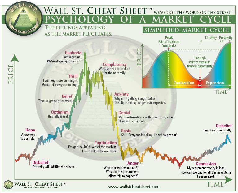
Another well known saying is: “Be fearful when others are greedy and greedy when others are fearful – Warren Buffet.” With this, Buffet is saying that you should buy low and sell high. This seems obvious, until the market hits the ‘anger’- or ‘depression’-phase; in those moments, most people don’t even consider buying.
Candles
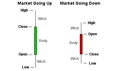
Most graphs in technical analysis present market movements by way of ‘candles’. These candles offer more information than traditional line graphs. A green or white candlestick means that the price has risen since the last candle, while a red or black candlestick means the price has dropped since that last candle. These parts are called the body, and they show the opening and closing price for that time interval, meaning: when the body is green, the bottom of the body is the opening price and the top is the closing price, which results in a net positive. If the body is red, that means the price closed lower than it opened, and so the top of the body is the opening price and the bottom is the closing price.. The vertical lines above and below the body are called ‘shadows’ or ‘wicks’, and they represent the highest and lowest recorded trading prices during this time period.
Support and resistance
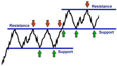
In TA it’s common to see lines drawn on graphs to show where the ‘support’ and/or the ‘resistance’ are. When the market is in an upward trend and the graph shows that there’s a downward breakthrough of the support, this could mean that the upward trend has become a downward trend. It could be a signal to sell. In this case the support often becomes a resistance. Conversely, when a resistance is breached, this could be a signal to buy.
Supports and resistances are very important in TA. They are often ‘tested’ multiple times. This means that the graph will reach the line of support/resistance, but won’t breach it. Each ‘failure’ of this test (meaning: the support or resistance aren’t breached) makes the support or resistance more significant. When the test does pass after several failures, this should have a more noticable impact on the market, and it will be (more likely) considered a strong signal.
Important detail: support and resistance should be thought of as zones and not strictly defined borders with no or little margins. Whenever a trend ‘breaks through’ a support, this doesn’t automatically mean that the support is actually broken, or that the initial analysis was wrong. It could still bounce back. Technical analysis is not an exact science.
Correction
After a leg up there’s often a correction or a retrace down. When the market is in an uptrend it will correct less down than it went up. A correction can of course also occur to the upside.
Beartrap/bulltrap
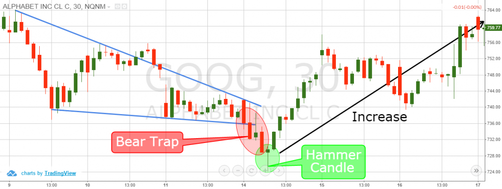
Beartraps and bulltraps are sayings used to point out that sometimes, things are not what they seem. When one or several candles show a downward movement and break through a support, this would seem like an indication of a downward trend. But when this is followed up by an upward trend, it’s called a beartrap; we were led to believe it was a bear-movement, but it wasn’t. The opposite of this is called a bulltrap: there seems to be an upward trend, but this swiftly turns downward.
Relative Strength Index (RSI)
RSI is an indicator that could be used to determine whether it’s a good moment to buy or sell. The RSI is a scale that runs from 0 to 100 and it is split in three sections: 0 to 30, 30 to 70, 70 to 100. If the RSI has been below 30 for a while, this means that there have been a lot of sell orders. This would mean there’s a good chance the market will turn and the price will increase soon. If the RSI has been above 70 for a while, this could indicate a greater chance for an incoming correction or retrace. While RSI can be used for many other instances, we’ll leave it here in this beginner’s guide.
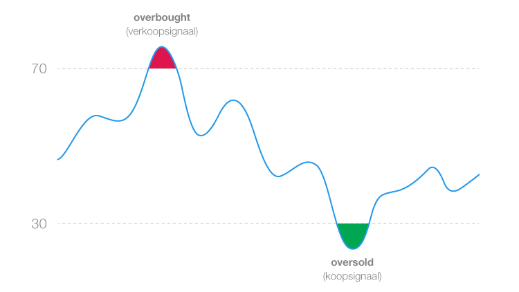
Chart patterns
In technical analysis, many types of patterns are used as potential indicators. Here are some of the most commonly used patterns.
Triangles
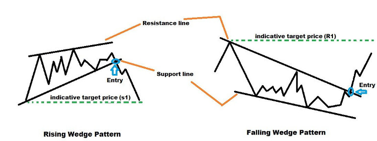
Triangles can be used to learn how a market has developed itself, and how it might develop in the future. Well known examples are the ‘Rising Wedge’ and ‘Falling Wedge’. A rising wedge could indicate a downwards movement after a period of incline, while a falling wedge might indicate the opposite. You might recognize a rising wedge by its continuously increasing peaks and its lower bottom prices. A falling wedge has continuously weaker peaks and more shallow bottom prices.
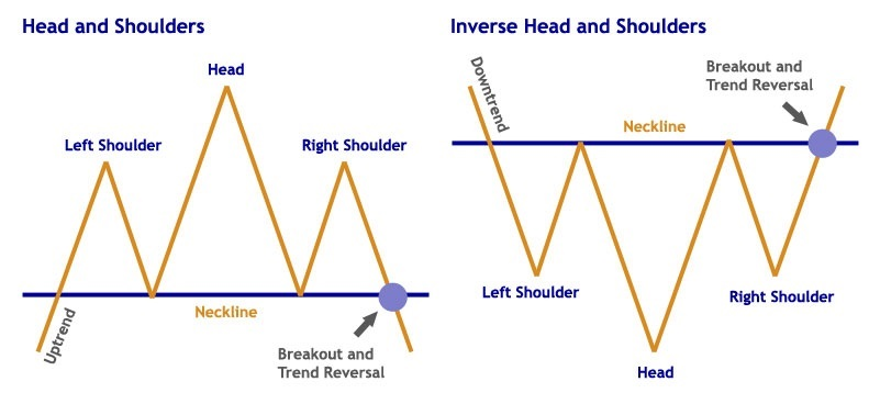
Head and shoulders
Two other common patterns are ‘Head and Shoulders’ and ‘Inverse Head and Shoulders’. An H&S indicates a downward trend, while the inverse H&S indicates an upward trend.
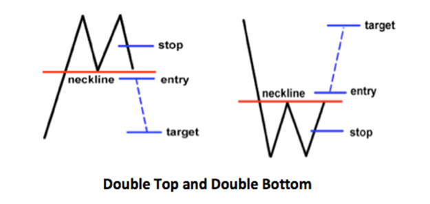
Double top and double bottom
A double top indicates a downward trend, while a double bottom indicates an upward trend. These indicators also come in the way of ‘triple top’ and ‘triple bottom’.
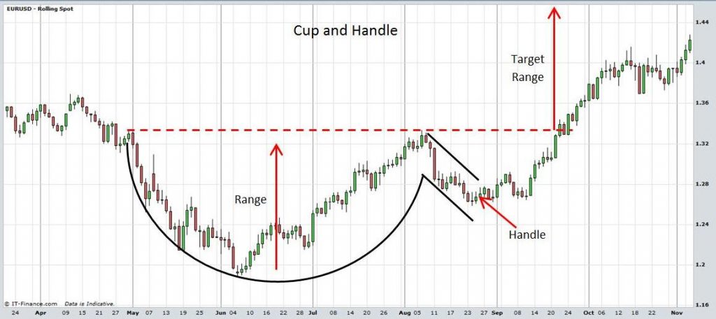
Cup and handle
A cup and handle is a bullish indicator, pointing to an increase in price.
DISCLAIMER 2
Much of this guide and its explanations come with ‘ifs’ and ‘buts’. Before investing, we advise you to study this matter further, and don’t think of this introductory guide as trading advise.
This guide merely functions as an introduction to technical analysis, to show how technical analysers come to their predictions. The most commonly used website for those interested in TA – for sharing their concepts and ideas – is Tradingview. If you wish to learn more about TA, then a good next step would be to follow certain traders on Twitter. Our tips to follow:
Follow @bapao83
Follow @FatihSK87
Sources
- http://pleasevisittogainmoney.blogspot.nl/
- https://www.fidelity.com/learning-center/trading-investing/technical-analysis/introduction-technical-analysis/basic-concepts-trend
- https://blog.goodaudience.com/answering-all-cryptocurrency-newbie-questions-d1683652dec8
- https://www.investopedia.com
- https://www.beststockpickingservices.com
- http://www.onlinefinancialmarkets.com/